The Evolution of a Logo
Share
Do you ever wonder how logos are made?
How does somebody imagine the Nike swish, or the Pepsi globe, or the two overlapping circles of Mastercard?
Well, I can't really answer those questions or give insight into the backstories of those logos. I'm here to talk about my brand story: read on to learn how the new logo for Heartisan Creations was birthed.
It all started with an itch. I wasn't happy with the previous logo anymore. It's a design that I'm still proud of, but I created this logo when I was fresh out of university and trying to start a freelance design business. The logo doesn't really speak to what I'm trying to do now - with my art business.

The original Heartisan Creations logo, circa 2018.
I wanted this new logo to evoke what I envision my brand and art business to be all about. To me that encompasses and intersection and overlap of slow fashion, one of a kind wearable art, original stamped block prints, and anything else I imagine I might want to sell in the future.
This online shop isn't just one thing - it's everything!
This led me to the idea of a Venn diagram.
You've probably seen one before, in elementary school math class. It's the concept of groups or categories that have overlapping or shared attributes. Venn diagrams are usually made up of two or three circles where common attributes are grouped in the intersecting sections.


Left: A three-set Venn diagram. Right: A simple tree using three circles.
I liked the idea of a three-set Venn diagram because to me it looks like a flower, or a crude shape of a tree.
I began working with this idea and developed a few early designs (that I won't be sharing in this blog, haha).
During a Google Image search deep dive I came across something I had never seen before or even considered: a Venn diagram four-set.

A four-set Venn diagram.
This new shape excited me! Not only did it evoke a stronger floral reference, but it also contained a heart shape - it's like it was meant for me.
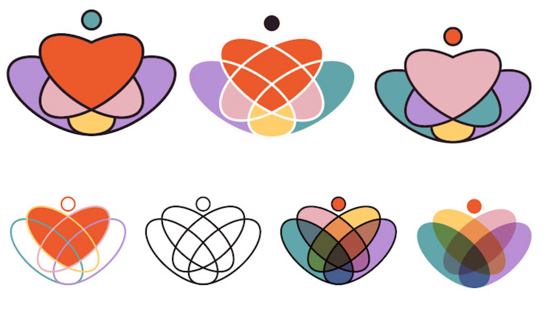
Working with this new basis for the logo design, I went through a lot of iterations.
At first I thought it would be easy to just use the outline. I felt it needed a little something extra so I added a small circle at the top, separate from the main shape.

An early logo iteration, featuring the outline of the Venn diagram with an additional circle.
Then I experimented with using my new brand colours in the ovals that make up the four-set. I enjoyed the look of the colours all blending together in the overlapping sections, but ultimately felt like this was too busy to use for my logo.

A personal favourite, but too busy for my logo.
I decided to continue experimenting with colour, and I enjoyed how the overlapping ovals created many sections that could be used individually, or colourfully grouped to form new shapes.

Colouring the sections to create a heart shape.
Choosing to stick with the heart shape, it was then just a matter of creating a colour combination I enjoyed. I had chosen my new brand colours a few weeks prior, so I had a restricted palette to work with.

Fleshing out the colour combinations.
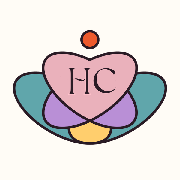
Once I removed the criss-crossing lines inside of the heart shape, I knew I was getting close to the final logo.

Getting there...
My first logo and branding overview relied heavily on my first love: teal. I wanted to keep that reference and made the second-largest sections in the shape my new blueish-teal colour. The rest of the sections were easy to fill in after that.
Separately, I had also chosen a new font and letter combination to use for this brand refresh. Putting all of the pieces together - the shape, colours, and typeface - was truly an exhilarating moment!
I hope you like this new logo as much as I do!


